
Choosing Color With Intention
When I was choosing the colors for my logo and website, I had to slow myself down more than I expected. This wasn’t about design trends or even my personal favorite colors. It was about how I wanted people to feel the moment they stepped into my space. Before they read a word, clicked a link, or booked a call, I wanted the experience to feel calm, capable, and grounded, with a quiet sense of forward momentum.
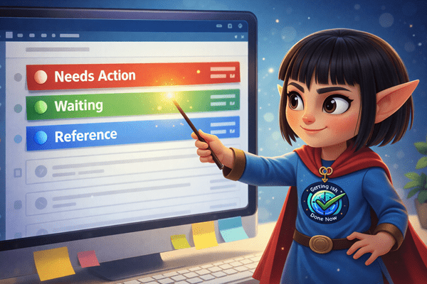
That intention led me to a palette built around blue, green, and orange. Blue became the foundation because it conveys trust, steadiness, and structure, qualities I want people to associate with my work right away. Green followed naturally, bringing a sense of balance, growth, and calm. Orange came last, not as a dominant force, but as a spark. It represents momentum, clarity, and action without urgency. Each color has a role. None of them are there just because they look good together.
As I made those choices, I realized how closely the process mirrored how I approach everything else in my business. Systems, schedules, workflows, and boundaries all work best when they’re designed with intention instead of impulse. When each element has a purpose, the experience becomes easier to move through and far less stressful.
For me, color became another quiet way to communicate care. Blue, green, and orange work together to signal safety, clarity, and forward movement before I ever say a word. Long before we talk strategy or structure, the colors are already doing some of the work, and that is exactly what I wanted.